Spotify
CREATIVE DIRECTION: Will Adams
ART DIRECTION: Gaby Re
DESIGN: Jessica Hägg, Linn Livijn Wexell
UX: Liz Wells
DEVELOPMENT: Arnaud Tanielian, JP Gary,
Oskar Tilly, PJ Alhberg
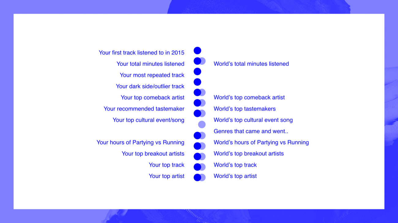
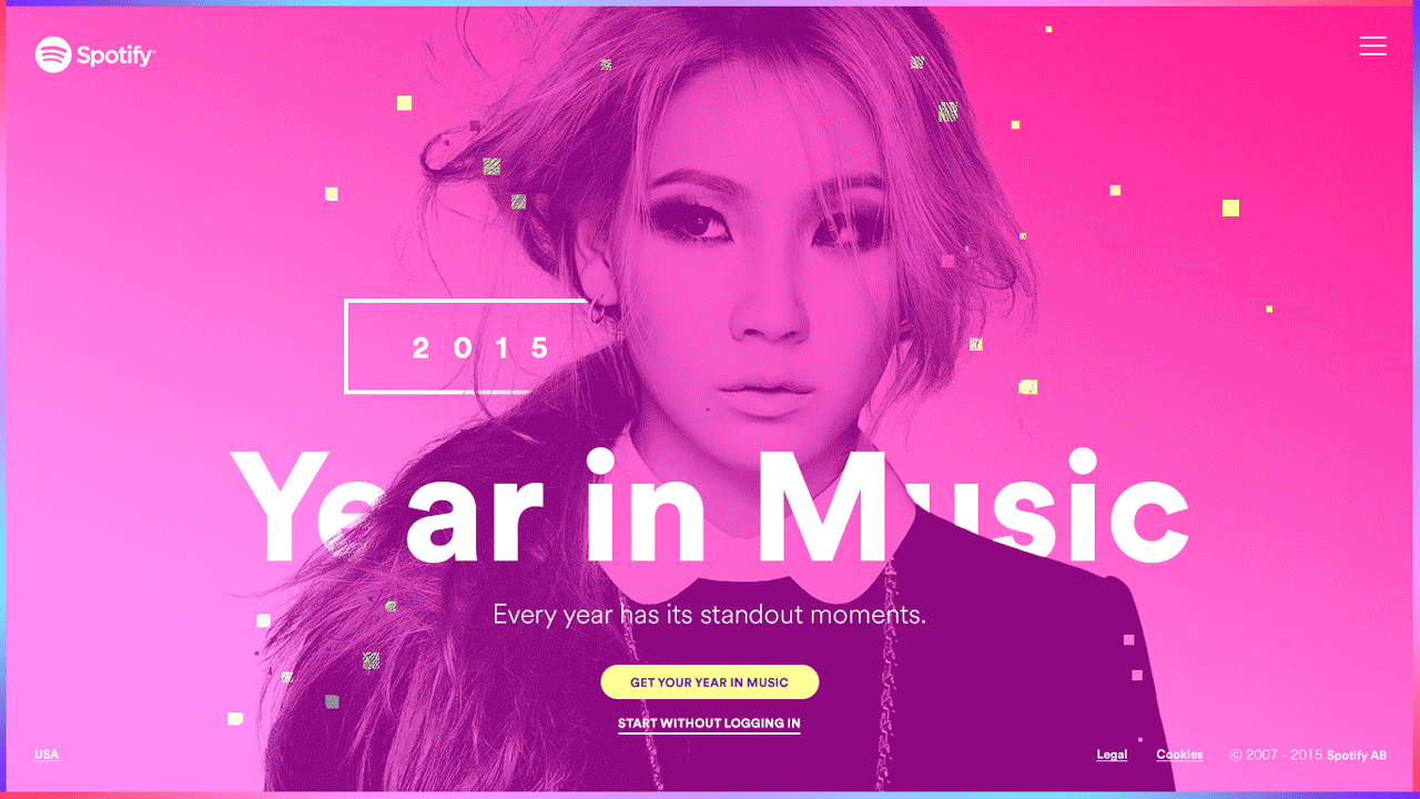
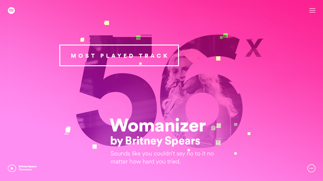
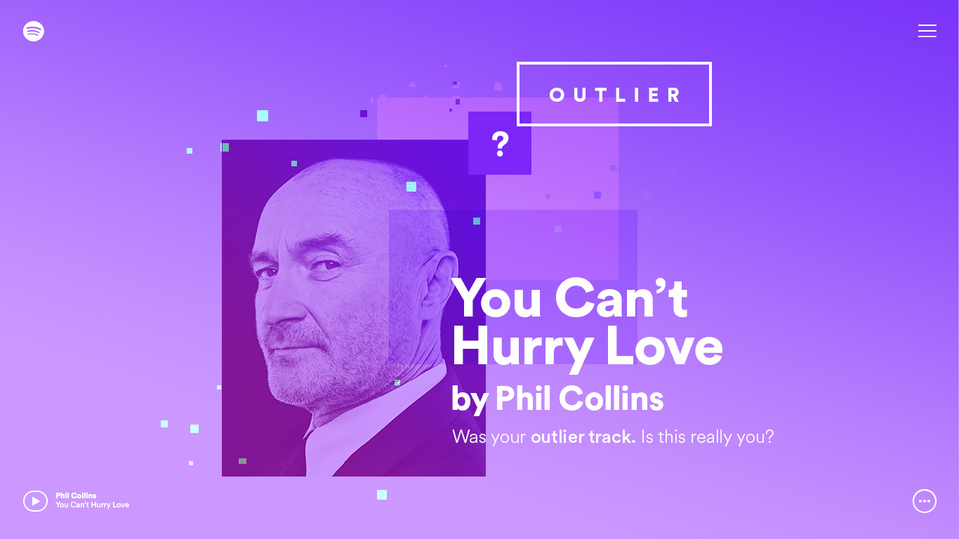
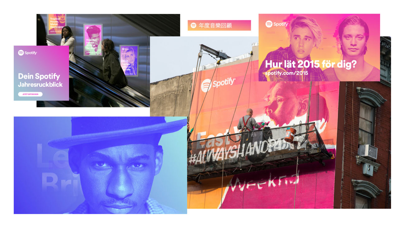
At Stink, I translated Spotify’s data into a visually dynamic celebration of their year in music. The brand campaign revealed what each individual user listened to the most in 2015, including results such as the first played song, top songs, top artists, total minutes of music, and total number of songs/artists played.
This experience could then be socialized with friends by generating a custom URL for each data result and shared across social media. There were also custom playlists generated at the end of the campaign experience for each individual user. This was a celebration of music and an opportunity for fans to enjoy a playlist of songs that they are guaranteed to love based on their 2015 listening habits.
It was my intention to render the experience so stylistically unique, while leading the initiatives following the release of Spotify’s Year in Music to promote the campaign, including TVCs, digital media and outdoor advertising in collaboration with Colossal Media, to render local data insights as hand painted murals at select locations in New York and Los Angeles.
— Webby - Winner in Advertising: Best User Interface
— Webby - People’s Voice Winner in Advertising: Best User Interface
— Webby - People’s Voice Winner in Advertising: Digital Campaigns
— Webby - People’s Voice Winner in Web: Music
— D&AD - Graphite Pencil / Digital Design
— Awwwards - Site Of The Day
— FWA - Site Of The Day
— FWA - Mobile Of The Day
This experience could then be socialized with friends by generating a custom URL for each data result and shared across social media. There were also custom playlists generated at the end of the campaign experience for each individual user. This was a celebration of music and an opportunity for fans to enjoy a playlist of songs that they are guaranteed to love based on their 2015 listening habits.
It was my intention to render the experience so stylistically unique, while leading the initiatives following the release of Spotify’s Year in Music to promote the campaign, including TVCs, digital media and outdoor advertising in collaboration with Colossal Media, to render local data insights as hand painted murals at select locations in New York and Los Angeles.
(づ  ̄ ³ ̄)づ
— Webby - Winner in Advertising: Best User Interface
— Webby - People’s Voice Winner in Advertising: Best User Interface
— Webby - People’s Voice Winner in Advertising: Digital Campaigns
— Webby - People’s Voice Winner in Web: Music
— D&AD - Graphite Pencil / Digital Design
— Awwwards - Site Of The Day
— FWA - Site Of The Day
— FWA - Mobile Of The Day
Discovery
Our initial challenge was to discover how to translate Spotify’s deep data set in a way that felt at once personal and global, all while being generated dynamically for each user; so we started by splitting this data insights based on the user’s logged in or out status and visualizing them on individual cards.


UX
Creating then a user flow and navigation model that had the right amount of personal and global insights to generate a personalized Year in Music experience that felt unique to each user.

Exploration
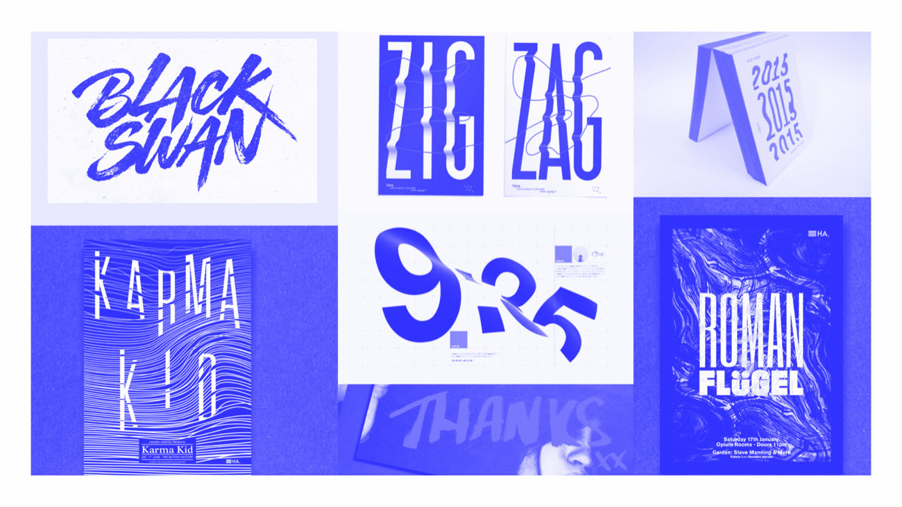
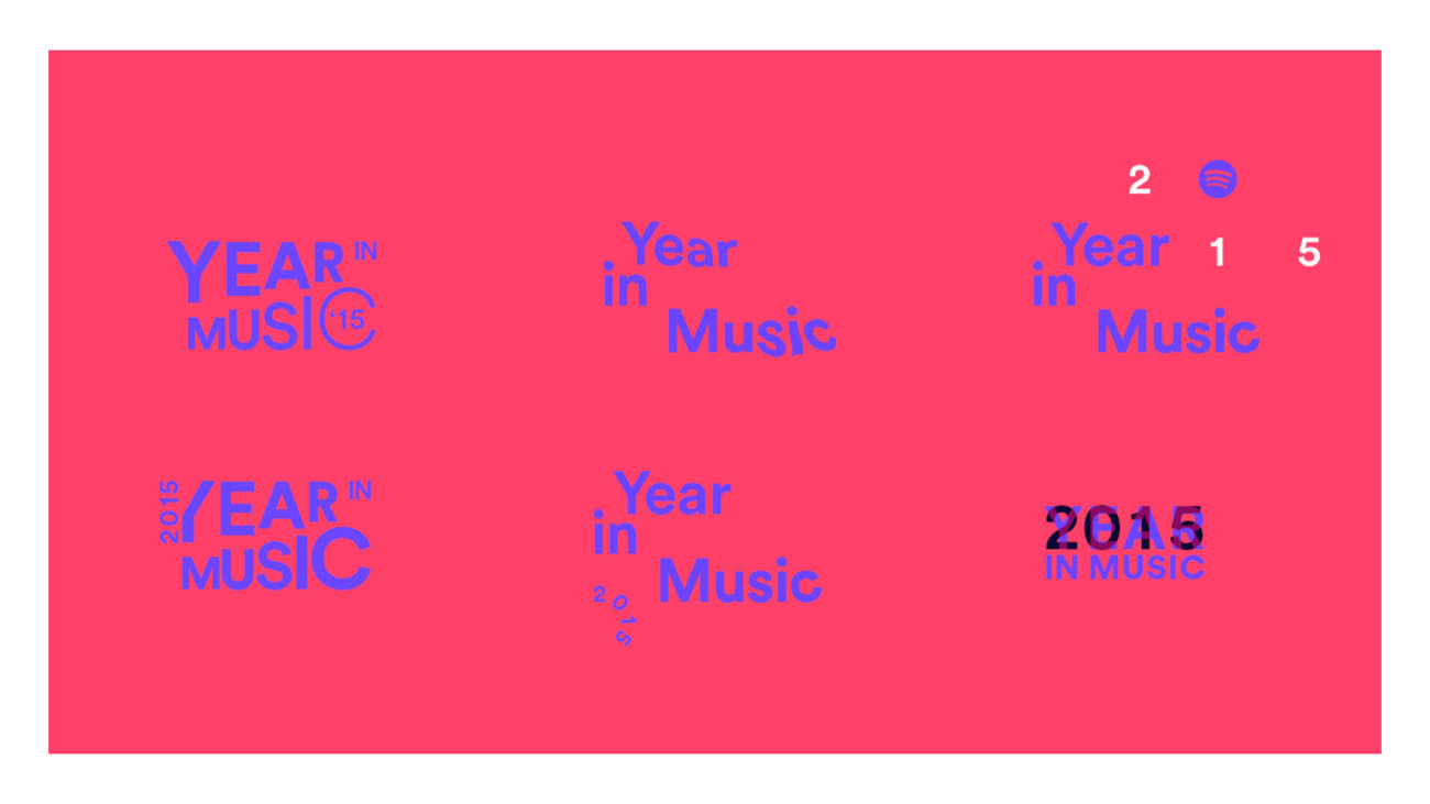
During the visual exploration phase I started playing with bold typography and data visualization, creating unique and custom branded directions.

Experiments
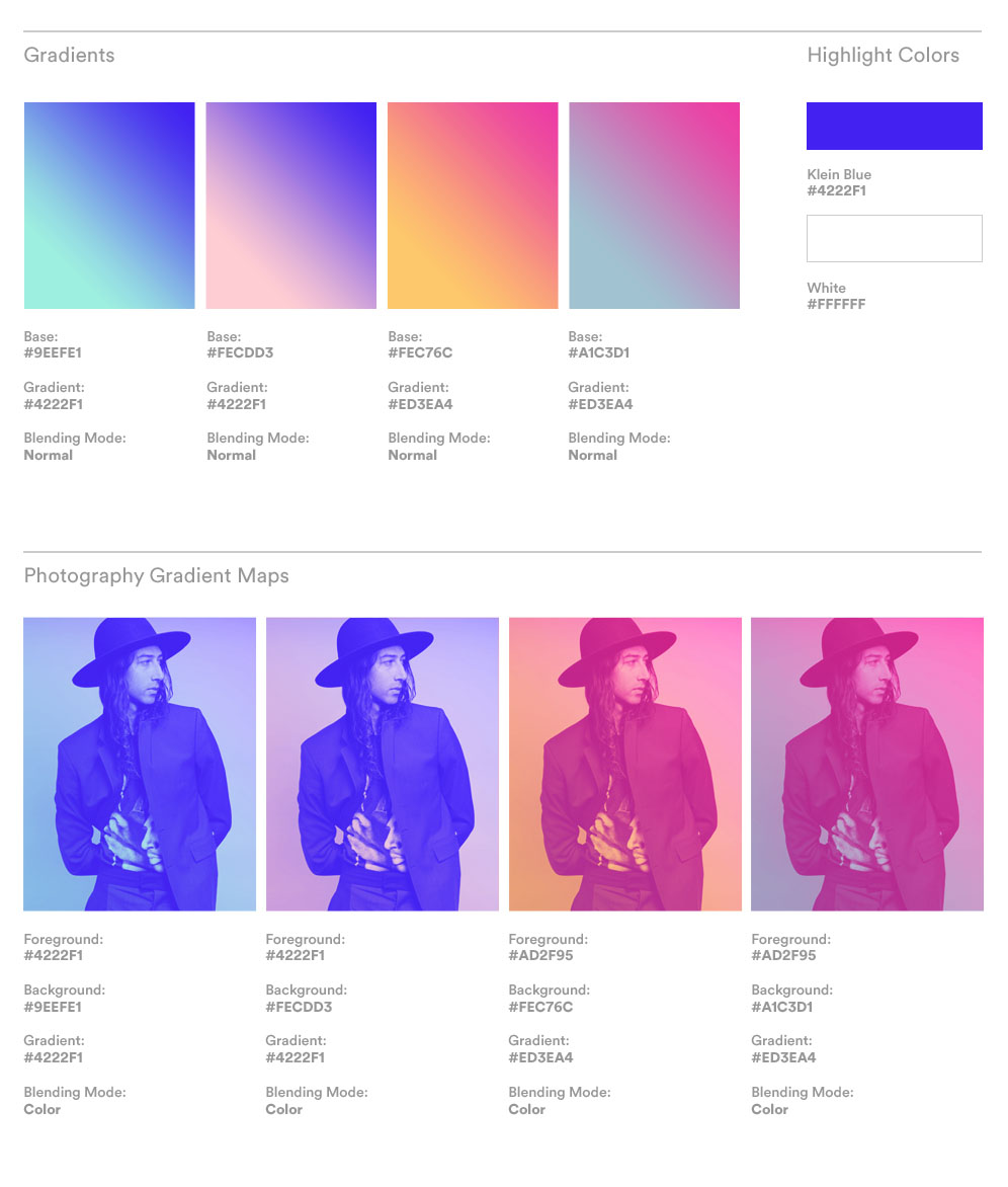
I then started experimenting with glitch effects as data viz using Processing, including gradients and digital “glitter” throughout the newly established design language.


Flexible System
I also started moving away from traditional data viz illustrations and creating a flexible layout that would pull out images from Spotify’s api dynamically while using custom shaders to generate gradients and a duotone effects on top of all the content loaded from Spotify’s API.


Design Handoff
A successful collaboration with the dev team was thanks to the creation of a git repo that would host all of the svg files, artist imagery and color guidelines


Global Campaign
Along with the digital campaign, I lead and created the supporting media, including digital display advertising, DOOH units, and 30s spots.
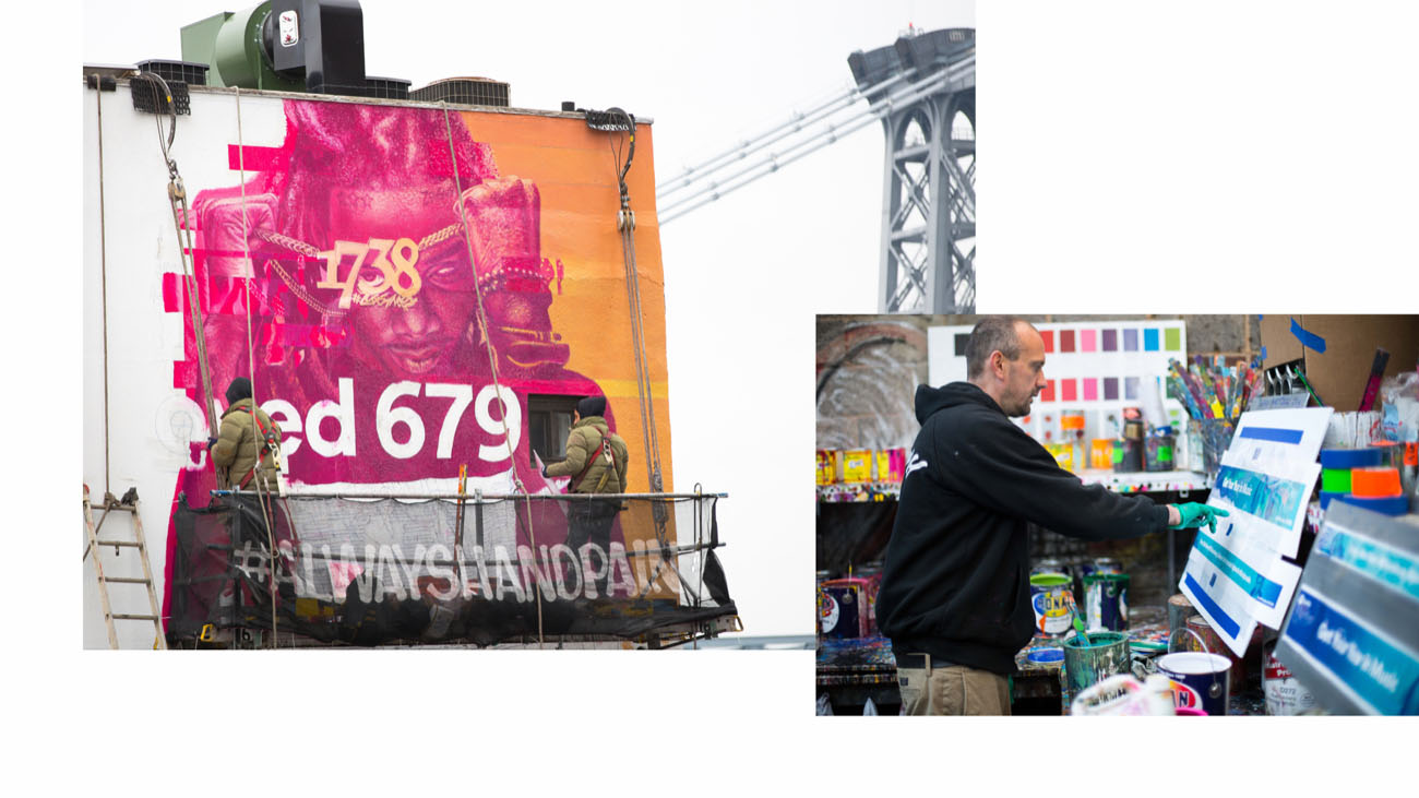
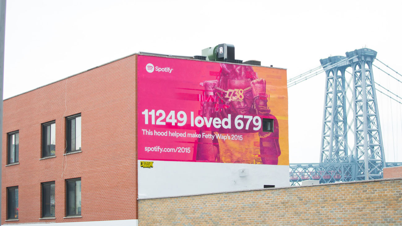
We partnered with Colossal Media, to render local data insights as hand painted murals at select locations in New York and Los Angeles.
We partnered with Colossal Media, to render local data insights as hand painted murals at select locations in New York and Los Angeles.


Murals
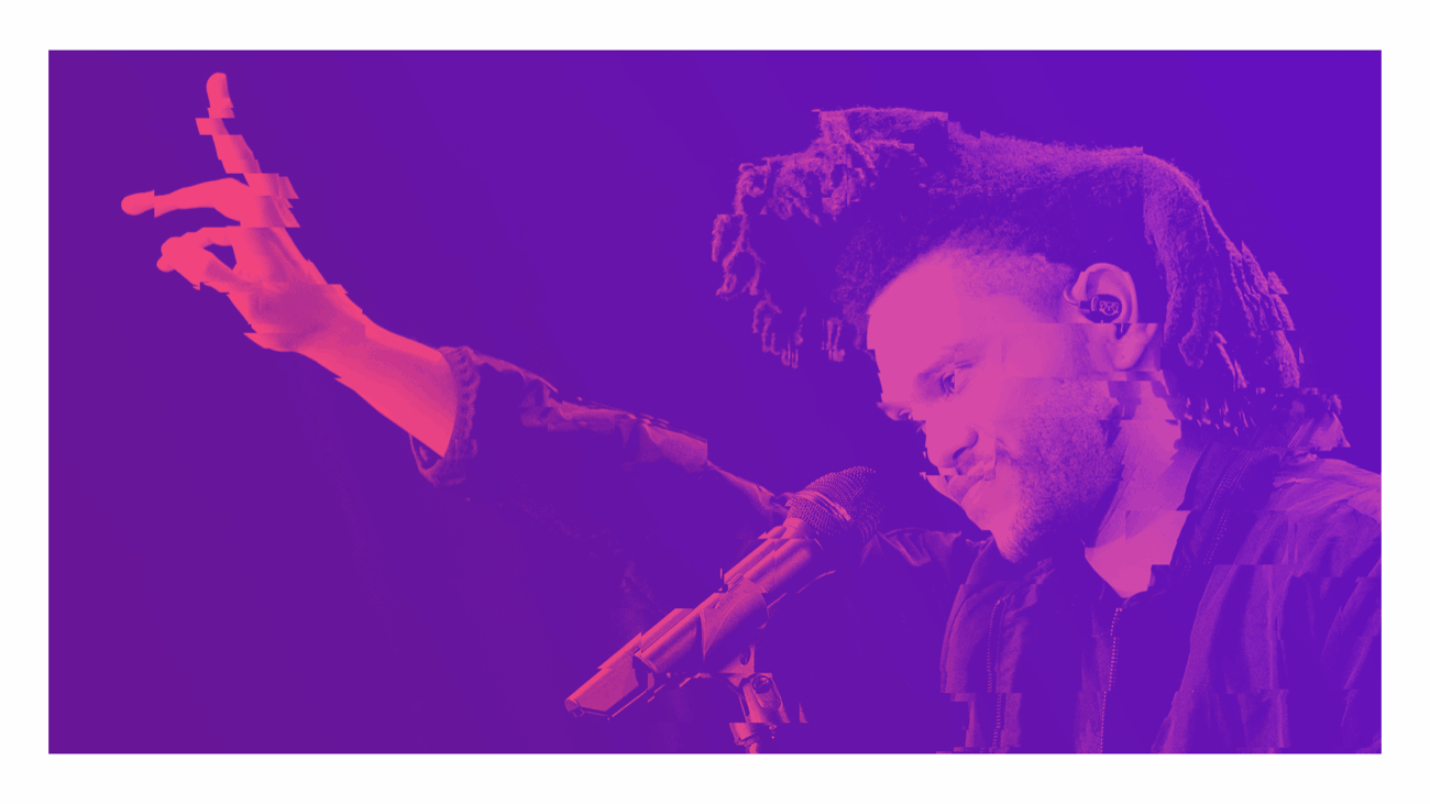
The process started with the high-res image provided by the artist’s record label, I would then crop, color correct and ran it through a Processing sketch to obtain the glitch effect. Finally I stylized the composition with custom made patterns and glitch artifacts that Colossal painted over with iridescent paint.


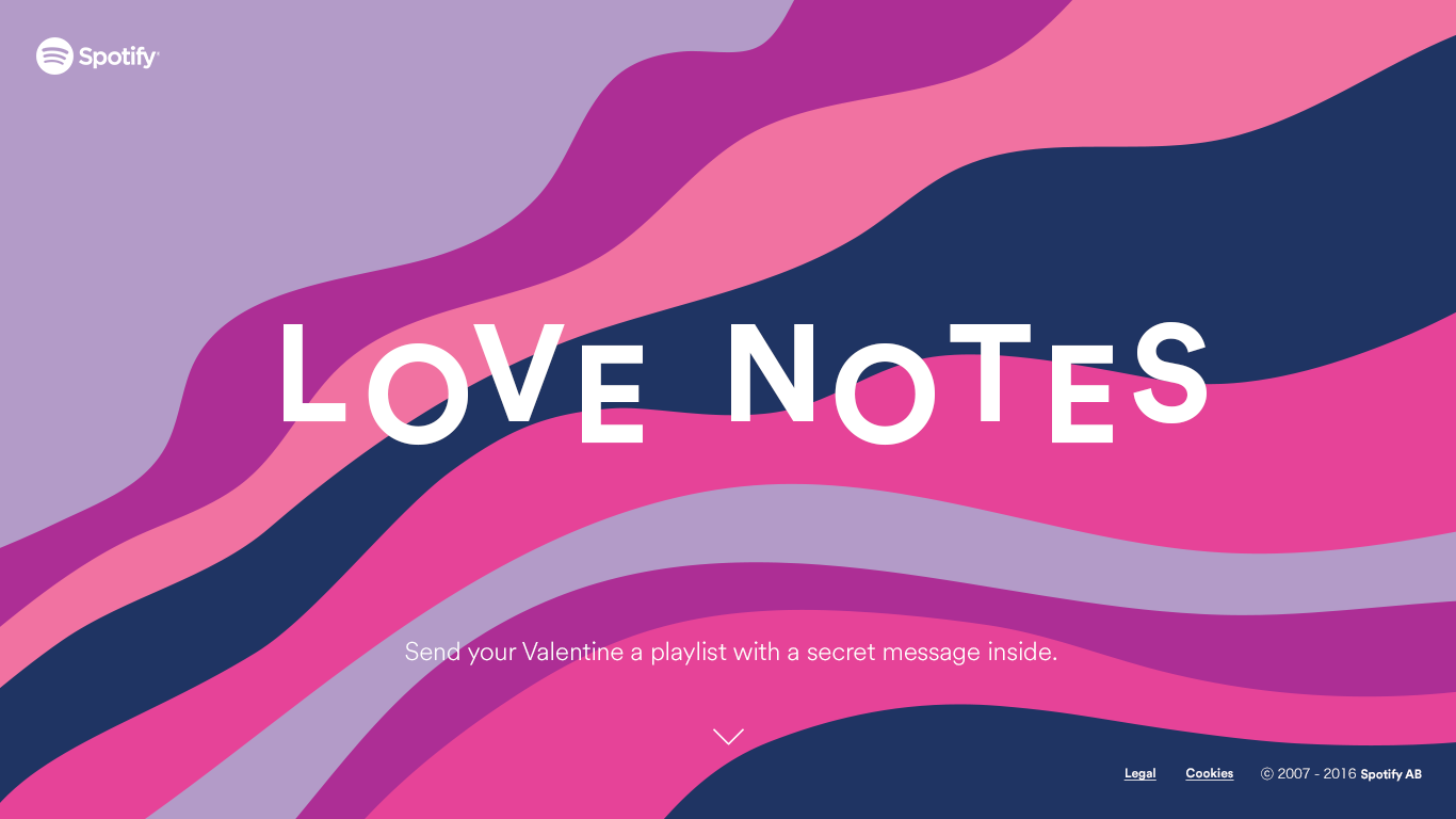
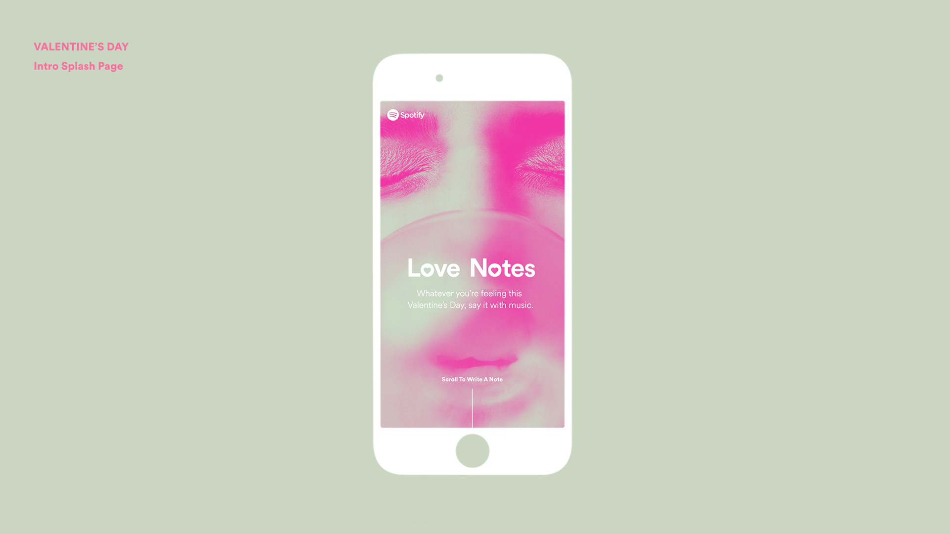
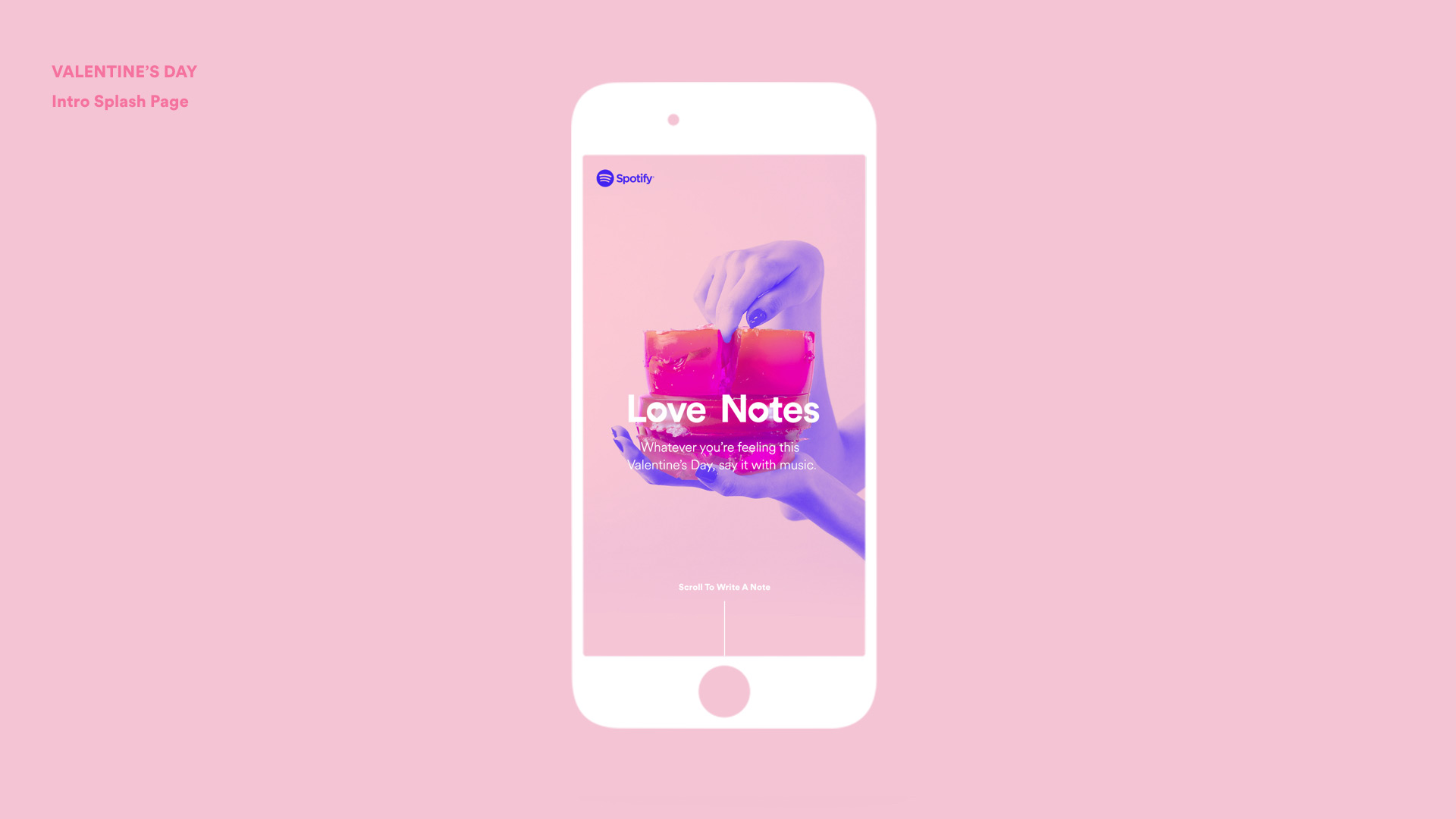
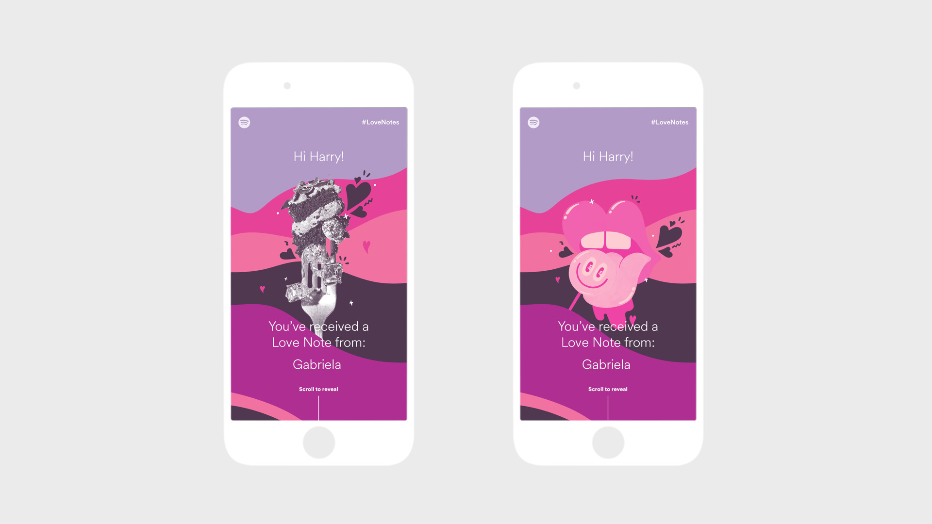
Loves Notes
Love Notes is an experience I led the design and UX of for Spotify that lets users send a romantic note as an acrostic playlist for that special someone to make Valentine’s Day a little more musical.
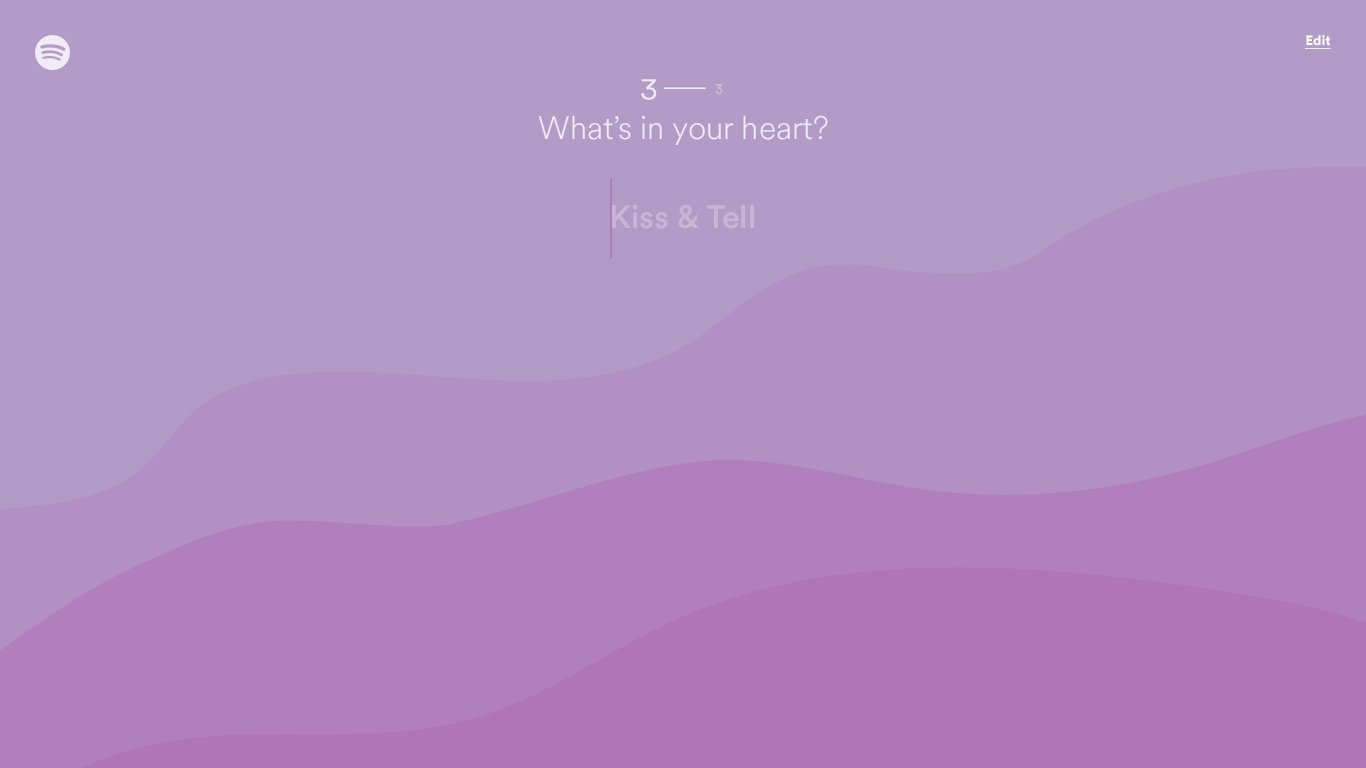
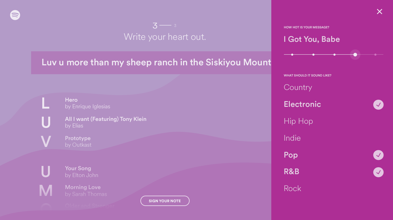
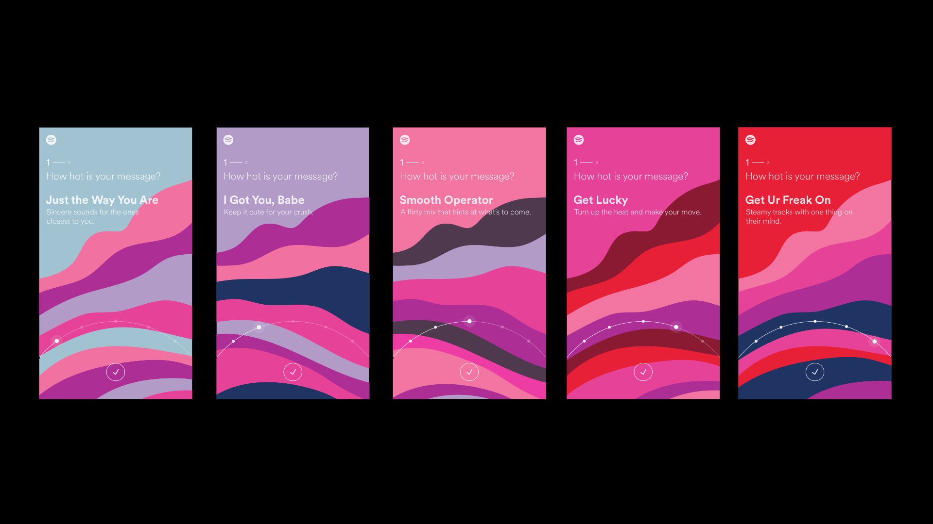
Users select a matching “heat level” for their intended recipient, ranging from intimate (Just the Way You Are) to steamy (Bump n’ Grind), then choose up to three genres and type out a message for a loved one. Love Notes will craft a playlist perfectly suited to the sender’s selected genres and heat level where each song’s title starts with one of the letters from the message.
— Awwwards - Site Of The Day
— FWA - Site Of The Day
— FWA - Mobile Of The Day
Users select a matching “heat level” for their intended recipient, ranging from intimate (Just the Way You Are) to steamy (Bump n’ Grind), then choose up to three genres and type out a message for a loved one. Love Notes will craft a playlist perfectly suited to the sender’s selected genres and heat level where each song’s title starts with one of the letters from the message.
(づ  ̄ ³ ̄)づ
— Awwwards - Site Of The Day
— FWA - Site Of The Day
— FWA - Mobile Of The Day
Discovery
During the exploration phase I started developing moodboards that would convey the feelings of our different heat levels from sweet & fluffy... to suggestively erotic.
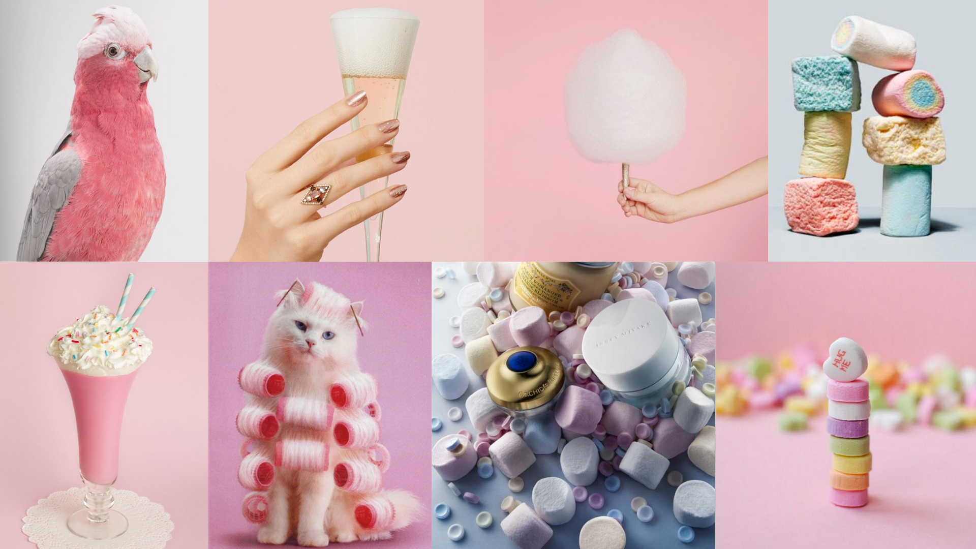
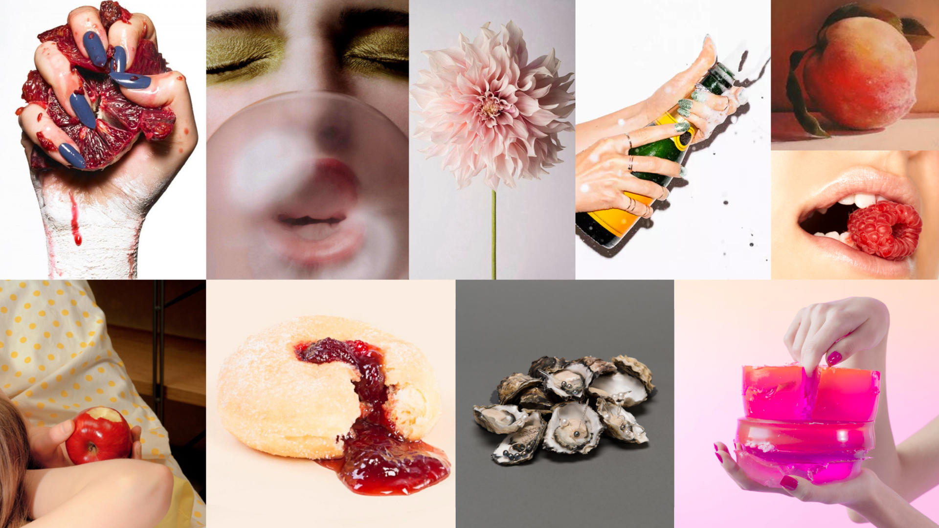
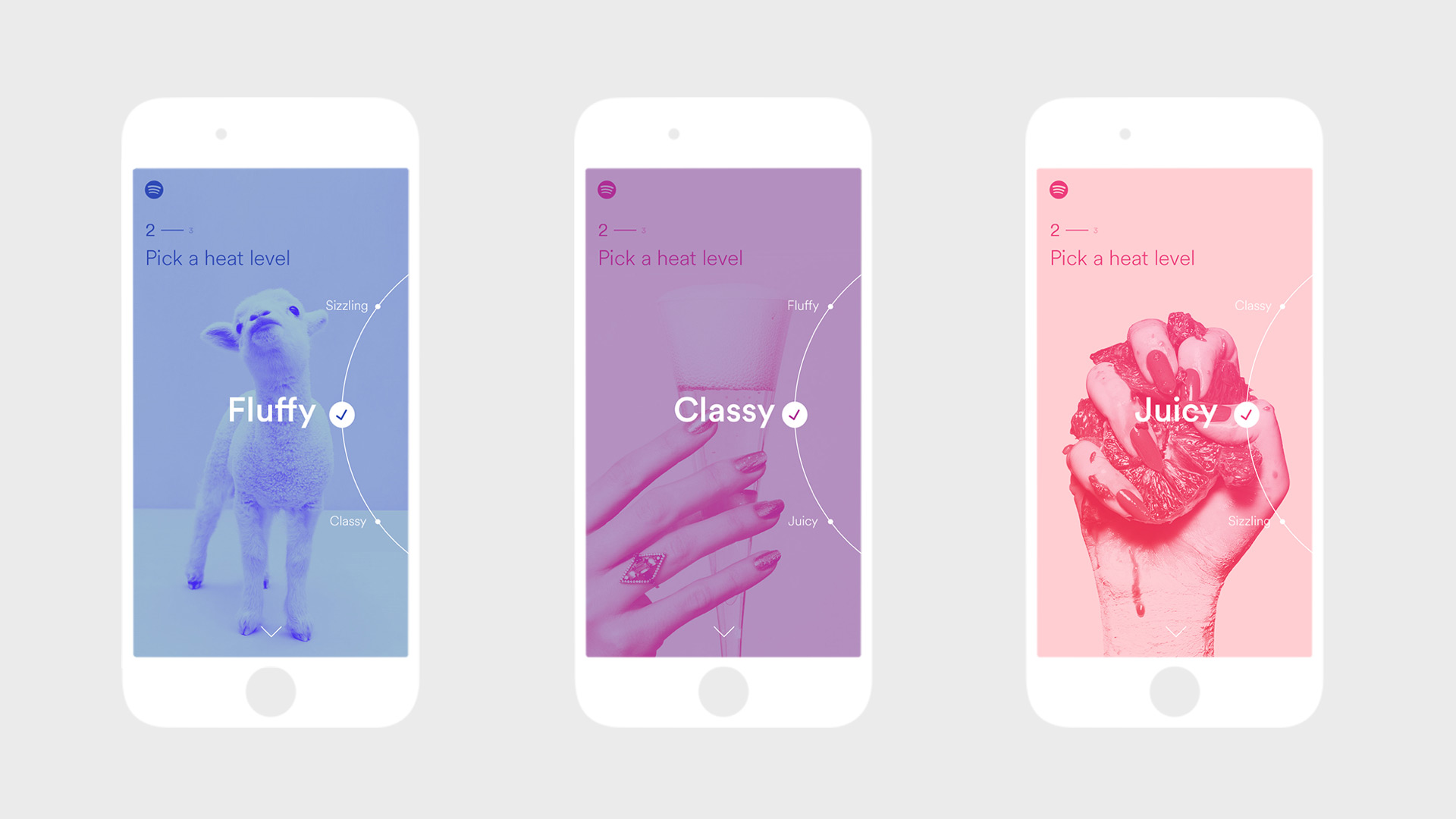
I also explored different illustration and photographic styles while playing with waveforms as a metaphor for the emotional spectrum of love and a range of amorous intensity.
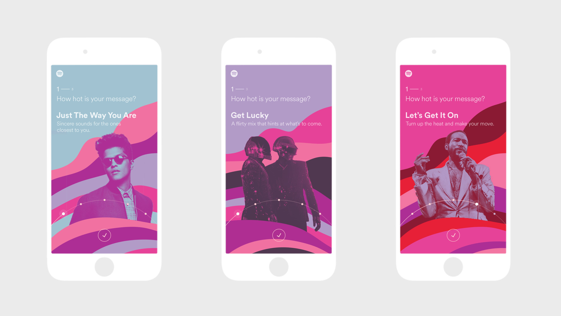
Design Direction
After several explorations and color combinations, we landed on a smooth progression of waves and colors that were later exported from Illustrator and converted from SVG vector points into bezier curves for HTML canvas rendering. This workflow allowed a great amount of control, with the rendered curves matching the design as much as possible. We added a WebGL shader to handle the continual motion when a user rests on a static page or changes heat levels.